Brand Kit
The colors, type and voice behind the new greencanyonhotsprings.com, for the family to confirm. All greens, all the way down, on beige. No black and no orange anywhere.
Colors
Paper
#D9D3C9
Page background and etching paper
Taupe
#6E6760
Warm notebook cards
Mint 50
#EEF4EF
Light sections and text on dark cards
Mint 100
#E0EDE3
Alternating sections and form fields
Mint 200
#CDE2D3
Cards, tags and hover fills
Sage 400
#8FB39C
Rules and borders
Canyon 700
#3F6B5E
Dark notebook cards
Hunter
#2F5D3A
Buttons and links only
Forest 900
#1C3326
Text, etching lines and data panels
Type
Headlines in Newsreader
Light, old-book serif. Every heading, fluid from phone to desktop.
Lettering in Windsor
Signage moments and short titles only, never sentences.
Body notes in Courier Prime. Phil’s voice reads like a typed letter, so the body type is a typewriter face.
Labels in Red Hat Mono, small and uppercase
Headlines never carry punctuation. Heroes are Title Case. No label sits above a headline, the label becomes the headline.
Voice
Mission
Keep a 115° spring open to the public, so families can soak, swim, learn and camp in the canyon.
Vision
The canyon the valley grows up in: the place kids from Sugar City to Victor learn to swim, and come back to with their own kids.
Values
Family-run since 1952. Open to the public, not sold off as a private ranch. Hard work and short pay, no regrets. Simple and fun.
Tone
Phil’s voice. Plain, specific, funny. No spa clichés and no hidden gems.
Promise
Come as you are, stay as long as you like, and the water is always ready.
Personality
The friendly neighbor who has run the pool for 50 years and still soaks in it twice a day.
Drafts from the family’s own site and history, for approval.
Drawings
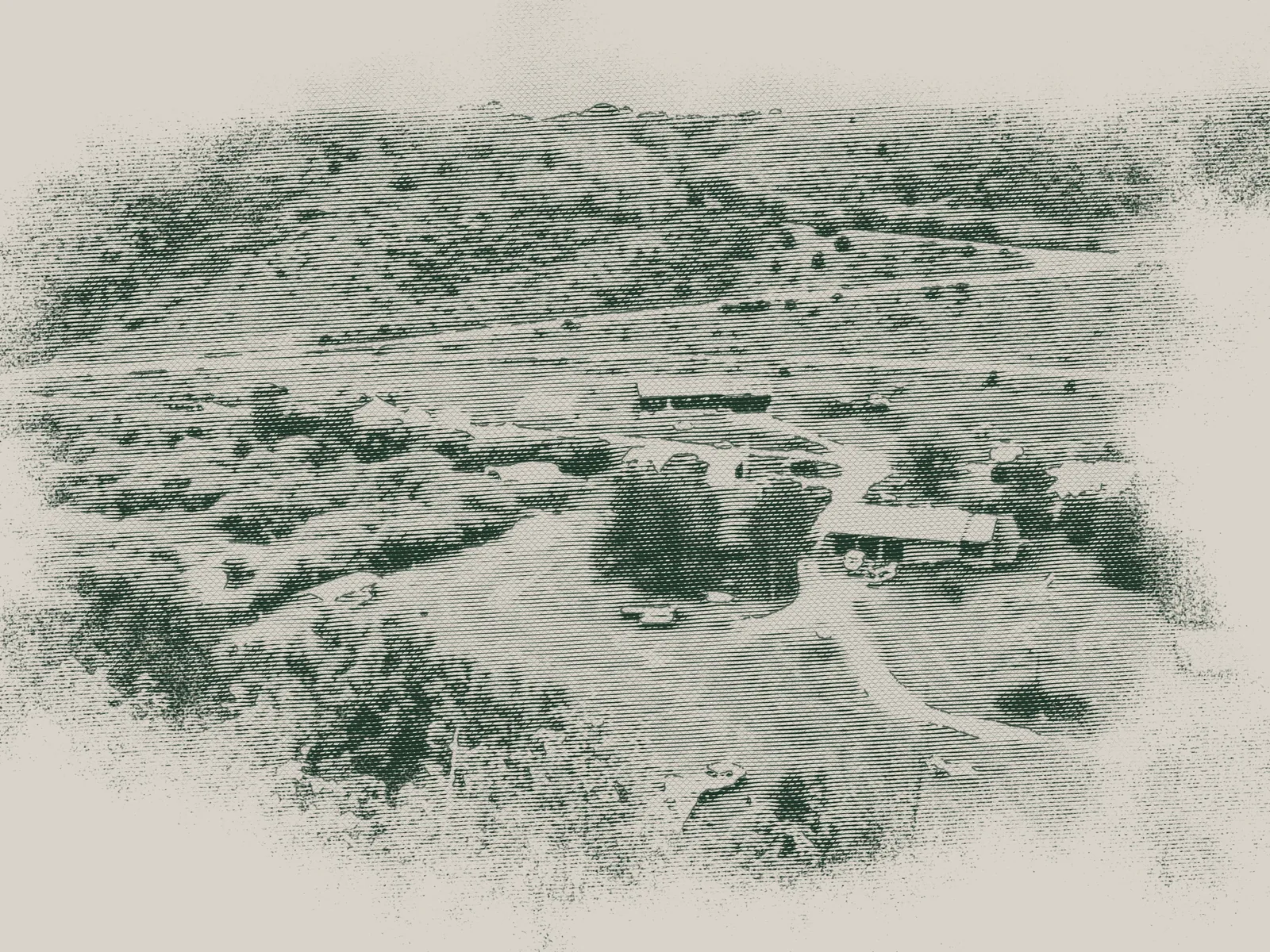
Every photo becomes forest green line art on paper, so the drawing melts into the page with no box. Every archive image keeps a credit line.